Career Advice
Choosing The Best Font for Your Resume
We’ve always heard that first impressions count. For resumes, this is certainly true.
Recruiters form a first impression of a candidate right away, from the first glance at his or her CV.
How long was that glance? 6 seconds.
Imagine having your future career decided within 6 seconds! Even in smaller firms, HR is often swamped with applications, and the HR officer often cannot spare more than a few minutes to read through your entire CV.
We often get questions about layout, formatting, icons, pictures, etc in resumes. These are important, but there are other considerations. HR departments today are notorious for their use of Applicant Tracking Systems (ATS) – these automated CV scanners screen a CV for certain keywords, and reject those that don’t meet their criteria.
Because of the way these scanners are designed, fancily-formatted CVs with nice icons and graphics are often filtered because the scanner cannot understand these icons/graphics/pictures, and decide that the CV is ‘blank’ instead.
So when it comes to resumes, it’s best to use a CV template that’s simple, clean and easy to read.
As recruiters, one of the first things we notice about a CV is also the font candidates use.
This seems like a minor thing. But in fact, the font you choose speaks volumes about your CV!
Best Professional Fonts For Resume
Let’s take a look at a CV from a hypothetical candidate A:
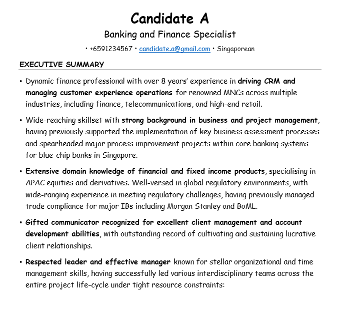
I’m sure you’ve seen fonts like this before. This font, Comic Sans, is actually widely considered by graphic designers to be one of the worst fonts to use, in any context!
The finance sector is a formal industry with a rich history. This candidate has excellent career experience and would be an excellent fit in a major bank. But, if I were the recruiter, I’d discard this CV without even bothering to look at its contents. Why?
The font looks unprofessional and does not give the impression the candidate is serious.
It gave a poor first impression. It’s too casual and may even border on childish. What a waste! If the HR officer read on, I’m certain A would be called up for an interview.
1. Garamond
Let’s take a look at the same CV, using a different font:
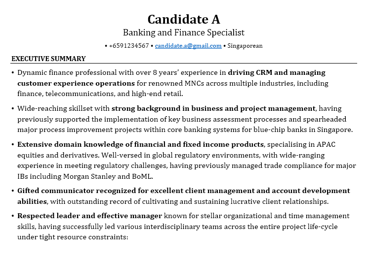
Much better! This profile looks appropriately formal, cleaner, more serious, and more professional. I would expect a serious candidate to present professional-looking profiles; my first impression of this CV would be the complete opposite of the previous one!
Again, using a professional font is super important in making the first impression. You must present yourself as professional and well-organised, otherwise your CV might be discarded.
One important consideration is standing out. There are many great fonts out there – there’s nothing implicitly wrong with the classic Calibri, Times New Roman, Arial, etc. But everybody uses them.
The HR officer will have seen them hundreds, if not thousands of times, and they thus aren’t eye catching. The impression formed isn’t one that is bad, but it won’t be a very memorable one either.
To stand out, we need to consider different fonts.
Let me first briefly touch on some technical details when we choose fonts (feel free to skip this if you just want the answers!). There are two main types of fonts: serif and sans-serif. Basically, the former looks like Times New Roman, while the latter looks like Arial. One has the additional curly bits attached to the ends of its letters, the other does not. This image from Wikipedia highlights the differences:
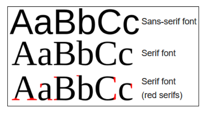
When we deal with long paragraphs of text, the general consensus is to use a serif font, as the additional lines are supposed to serve as ‘transitions’ for our eyes, making it easier for us to read and understand the text.
We can use sans-serif fonts for short phrases, such as the headers of our CVs (some common headers I use can be seen here in our Ultimate Guide to Resume Writing but for the main body of your CV you should absolutely consider a serif font.
I’ve found it to be the most effective out of the hundreds I’ve experimented with. It’s considered one of the most aesthetically pleasing and professional fonts, due to its classic yet polished look. This is the second font we saw above. I generally use this when writing for my clients, and I’ve seen great results thus far.
Some other professional font types I find useful are:
2. Cambria
This is described by its creator as ‘the new Times New Roman’. It’s fairly pleasing on the eye, and looks professional:

3. Constantia
This font is more ‘rounded’ than Garamond or Cambria. The general impression given is thus one of friendliness and approachability (that’s what the creator says, anyway!):
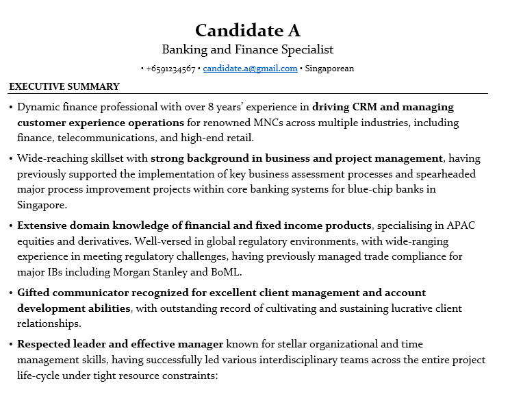
My take is that this sort of font reads best when printed. When attending an interview, you should take along printed hardcopies of your CV and you can use different fonts in the softcopy and hardcopy. Use Garamond when emailing the recruiter, but print your CV out using Constantia, or one of the other fonts discussed below.
4. Georgia
This font was specifically designed for use on computer monitors. The designer also claims that it has thicker strokes, which make it easy to read even when the font size is small.
This is a consideration if your CV is very lengthy, and you want to cut the absolute page number down (although most CVs can be easily fit into 2-3 pages – any more than that and you’re probably including irrelevant info that will be skipped!) Here’s an example:
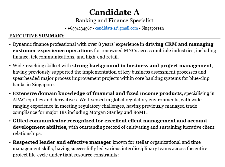
If you’re sending your CV as a PDF over the Internet, this is a great font to consider.
5. Lato
This isn’t a ‘standard’ font that comes with most computers, but I’ve included it as I personally like it quite a bit. While it’s a sans-serif font, it comes across as very readable. Indeed, its designer originally intended it for widespread corporate use, and considers it “serious but friendly” – that’s absolutely the impression we want to portray in a CV! A plus is that it also has different ‘weights’ (how bold it appears to be) that we can use to create some aesthetically pleasing designs, like bolding one section, and using a light font in the next line immediately (pay attention to the header of this example, for instance):
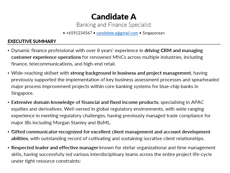
I personally love this style. It looks modern and stylish. It’s available as a free download – I’m not advertising for them here.
6. Helvetica
Mac and Apple lovers will surely recognise this font – it’s a classic used in almost every Apple device, and for good reason! Here’s a sample:
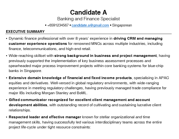
While this is again a sans-serif font, its clean appearance makes it look professional, and it’s easy to read even in long paragraphs of text. It’s widely used in many applications – corporate logos of many major MNCs use it (like Panasonic, BMW, Lufthansa, Toyota…), the MRTs in the US use it on their signboards, etc.
There you have it – our take on the best fonts for your resume.
We hope this gives you some inspiration on the fonts you can use in your CV.
Beyond looks, however, is content.
The most impressive-looking CV will do you little good if the content of your resume is not up to scratch. We’ve published some additional content on CV writing in this blog which you should pair with this guide. In addition, we also offer free consultations on your CV. Just fill in the form below. We’ll review your CV and get back to you with advice and areas for improvement.
Happy Job Hunting!

